The Top Tool That Lets You Instantly Create Stunning Color Palettes
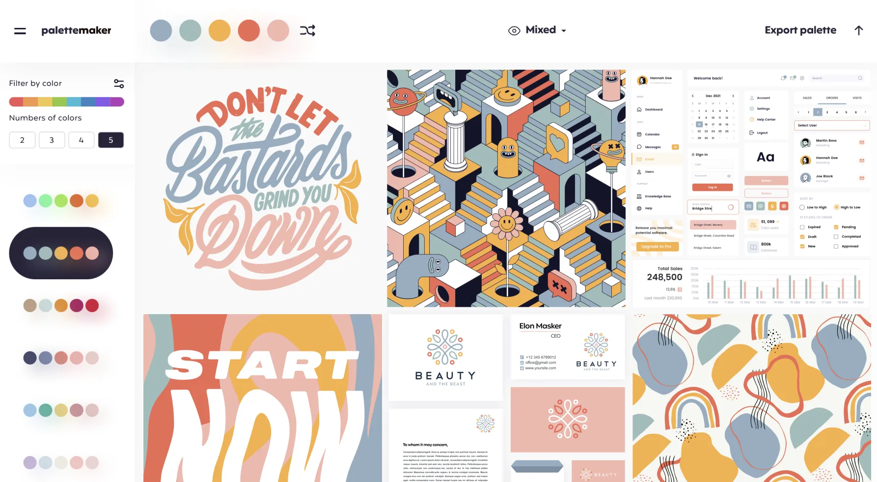
Choosing the right colors often feels like an art in itself, especially when you’re trying to design something truly striking. Whether you’re a professional designer or someone simply experimenting with creative ideas, color harmony can make or break a project. That’s where tools like Palette Maker come into play, offering a simple yet powerful way to explore color schemes and test them in real contexts. Instead of guessing how different hues will look together, this online tool lets you build palettes and immediately see how they behave in actual design formats like logos, user interfaces, posters, and illustrations.
What sets this service apart from many other palette generators is not just the ability to mix colors, but also the ease with which you can visualize them in real applications. You’re not limited to abstract swatches — as you create or modify a palette, you can preview it layered over common design templates to see how it performs in different creative scenarios. This makes it especially useful if you work in graphic design, branding, or web and app interfaces, where colors must work harmoniously across multiple elements.
The core idea behind the tool is straightforward yet thoughtful: reduce the guesswork and empower both artists and non‑designers to make better color decisions. Its interface is intuitive enough that even someone with minimal design experience can start generating palettes in moments. You can mix and match anywhere from two to five colors, adjust them as you like, or use pre‑filtered AI suggestions to get inspired. Once you’re happy with a scheme, export options let you save your palette in formats that fit your workflow — from image files to code snippets or formats compatible with creative apps like Procreate or Adobe products.
This approach comes from the mind of a seasoned visual designer who wanted a faster, more visual way to judge color pairings without toggling between multiple design tools. The result is a web app that’s both free and surprisingly robust, able to serve a wide spectrum of users — from hobbyists who want to enhance their personal projects to professionals who need quick, reliable color references.
Despite its simplicity, the tool opens up creative possibilities that many people overlook. Instead of being overwhelmed by endless choices or stuck with palettes that look good only in isolation, you get to see how your combinations interact in context. For many, this insight transforms how they think about color, helping them create more cohesive and visually pleasing work. If you’re curious to experiment with color and see how different schemes will look in real‑world designs, you can explore more about it here.


